Rules for using the Zakuro name, mark, and visual language. Everything here exists so the brand reads the same way across every surface — precise, controlled, no ambiguity.
Zakuro looks like a security operations centre that was designed by someone who gives a shit about typography. Dark, dense, precise — the kind of interface you'd trust with production credentials at 2am. The brand sits at the intersection of three things: the rigour of enterprise security tooling, the clarity of well-designed developer tools, and the confidence of someone who's already seen what goes wrong when agents run unsupervised.
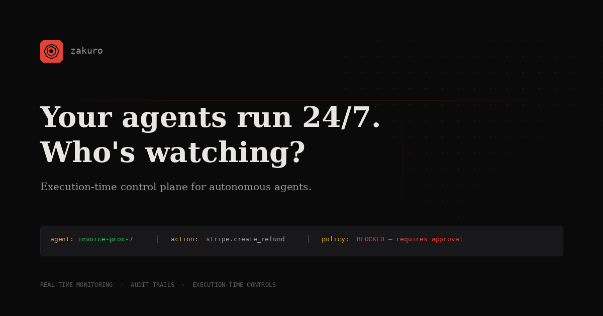
The aesthetic is not minimal for the sake of being clean. It's dense with information and restrained in decoration because the product watches everything and shows you exactly what matters. Every visual choice serves that idea. The dot grid in the background isn't a texture — it's a monitoring grid. The scan line isn't an animation — it's a sweep finding things. The red isn't an accent colour — it's what a blocked action looks like.
If CrowdStrike and Linear had a product together, built by people who spent a decade in crypto data infrastructure and security incident response, it would feel like this.
Near-black backgrounds with warm neutral text. Not blue-black. Not purple-black. Actual dark, the kind you'd run in a SOC at night. The darkness isn't an aesthetic — it's the natural environment for people who spend their days reading logs and traces.
Show more, decorate less. Terminal-style feeds, structured evidence traces, stacked data. The product monitors everything an agent does, and the brand reflects that — dense with meaning, sparse with ornament. Every pixel is either data or space for data to breathe.
Tight spacing, monospace labels, tabular numbers, strict colour semantics. Nothing wobbles or floats. The grid is visible. The corners are sharp. The hierarchy is obvious. This is a brand that knows where every element is, because knowing where everything is happens to be the product.
Red is blocked. Green is allowed. Amber is pending. Grey is logged. These aren't decorative — they're status indicators carried through from the product into the brand. If you see red on the site, something was stopped. If you see green, something was approved. The brand's visual language is the product's visual language.
The tone is assertive but not loud. No exclamation marks, no "revolutionary" claims, no startup exuberance. The confidence comes from specificity — naming real tools, showing real traces, describing real failure modes. The brand doesn't ask you to trust it. It shows you the evidence and lets you decide.
The scan line sweeps. Pings appear where threats are found. Feed rows slide in when discoveries happen. Nothing animates for decoration. Every movement represents something the system is doing — scanning, detecting, logging, enforcing. If it moves, it means something.
The Zakuro logo is the mark plus the wordmark. Use the full lockup wherever space allows. The mark can be used alone when the brand has already been established in context — favicons, app icons, social avatars.
The mark is a circle (observation), a hexagon (containment), and a centre dot (the agent being watched). Three nested shapes, one concept: we see what's inside.
Maintain a minimum clear space equal to the height of the hexagon on all sides of the mark. Don't crowd it.
The palette is built around near-black backgrounds with high-contrast status colours. Red is the brand accent and the colour of blocked actions. Green is allowed. Amber is pending. Muted grey is logged. Every colour has a purpose — none are decorative.
Three type families, each with a specific job. Display headlines carry authority. Body text carries arguments. Monospace carries data, labels, and anything that needs to feel technical.
Direct, technical, self-aware. Someone who has built things, seen things, and is choosing to be honest about what they observed. The voice assumes the reader is a peer — technical, sceptical, and has been burned before.
Start with the observation, not the context. Be specific — named tools, real numbers, actual scenarios. Let long sentences carry arguments. Admit your own role in the problem if you have one.
Don't throat-clear with "In today's rapidly evolving landscape." Don't use rhetorical flips ("This isn't X. It's Y."). Don't perform urgency with short-sentence chains. Don't explain things the reader already knows.